
Advanced Settings User Experience
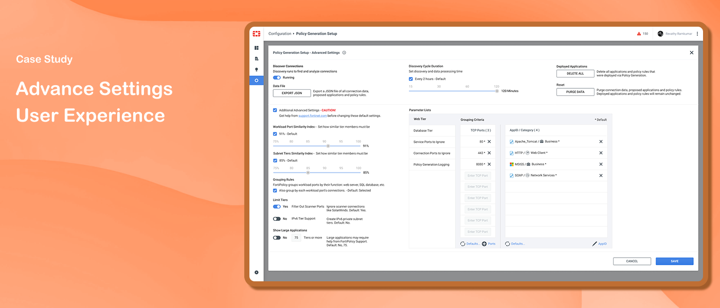
FortiPolicy uses machine learning to analyze network traffic and suggest security policies for data center workloads. To generate accurate recommendations, users need to configure policy generation settings. This case study covers the design of the Advanced Settings experience within the existing configuration wizard.
Challenge
A new requirement introduced Layer 7 features — controlling how applications communicate through protocols and services. These settings needed to be accessible only to Fortinet support engineers, not regular users. The challenge was to integrate these advanced settings into the existing configuration wizard without exposing them unnecessarily to regular users or disrupting the existing layout.
Solution
A settings experience that keeps advanced configuration one step away from regular users — seamlessly integrated into the existing wizard with clear guidance to prevent unintended modifications.
My Role
Staff UX Designer
My Responsibilities
Worked closely with the UX Manager to gather and understand requirements and discuss design direction. Responsible for wireframes, high-fidelity Figma designs, and developer handoff. Presented designs to the team for review and iterated based on feedback.
Duration
June 2022 – Aug 2023
Design Process

Discovery
The requirement was to design an experience that remained not directly accessible to regular users while staying fully accessible to support engineers. The advanced settings needed to be integrated into the existing configuration wizard — already part of the product — without disrupting the existing flow or confusing regular users.

Ideation
Two distinct user groups shaped the design approach — support engineers who needed full access to advanced settings, and regular network users who should not modify them.
Wireframing sessions helped visualize the structure of the interface and provided a basis for design discussions. During ideation, a toggle was initially discussed to enable additional settings. I decided to move forward with a checkbox instead — it provided a clearer visual indication of the enabled/disabled state, was already consistent with existing components in the product, and felt more familiar and less ambiguous than a toggle in this context.
Informative messages were also designed for regular users — placed contextually to guide them away from modifying settings without contacting customer support.

Prototype
The final design incorporated two key decisions:
Checkbox for additional settings — replaced the initially discussed toggle, providing a clearer visual indication of the settings state and maintaining consistency with the existing design system
Informative guidance messages — placed contextually to caution regular users against modifying advanced settings without support

Test
During internal review with the team, presenting application control information openly created confusion and space constraints within the dialog. I introduced a tab format to reorganize the application control settings - allowing options to be enabled one at a time and accommodating future settings expansion without cluttering the interface. This addressed both the usability concern and the space limitation.
The updated design went through a final review cycle before handoff to the development team.
Initial Wireframes


After Testing



Outcome
The team appreciated the final design - it successfully balanced the needs of two distinct user groups while keeping the interface clean and uncluttered.

Key Takeaways
Show users only what they need to see. The real challenge here wasn't just designing a feature — it was deciding how prominently to present it. Hiding complexity from users who don't need it, while keeping it fully accessible for those who do, is itself a meaningful UX decision.