
Workload Details User Experience
FortiPolicy is an enterprise security platform that uses machine learning to protect data center workloads. It analyzes network traffic, understands how applications communicate, and automatically suggests security policies tailored to each workload — helping organizations strengthen their cybersecurity posture.
Challenge
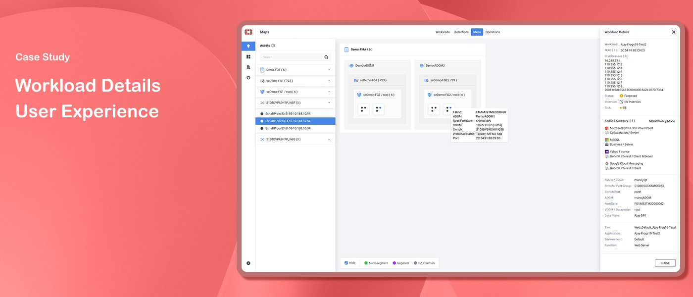
FortiPolicy monitors workloads - collections of computing tasks within a network, each comprising multiple ports. Security administrators needed a way to view detailed port-level information for each workload. The challenge was presenting this complex, multi-level data clearly without adding visual clutter to screens that were already information-dense.
Solution
A side panel design that presents all workload port details in context - keeping the main screen visible while surfacing detailed information in a clean, focused panel.
My Role
Staff UX Designer
My Responsibilities
Worked closely with the UX Manager to gather and understand requirements, discuss design direction, and align on the approach before execution. Responsible for wireframes, high-fidelity Figma designs, design style guide, and developer handoff documentation. Presented designs to the team for review and iterated based on feedback. Identified and proposed the MAC address dropdown to improve port navigation during internal review.
Duration
June 2022 – Aug 2023
Design Process

Discovery
The initial focus was on presenting workload-level information. Through stakeholder discussions and closer analysis, it became clear that port-level detail was equally important — security administrators needed visibility into specific port data, not just overall workload summaries. This expanded scope shaped the design direction.

Ideation
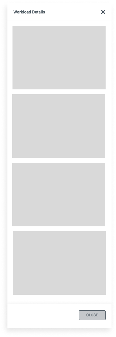
The gathered requirements were translated into a specification document that guided the design process, followed by wireframing to explore possible solutions.
The first approach was a table to display workload port details. However many screens in FortiPolicy already contained tables — adding another table created layout complexity and visual noise on already information-dense screens.
A dialog was then explored for presenting workload details. While this worked structurally, it had a significant drawback — the dialog concealed the header-level information, losing the context users needed while reviewing port details.
After several rounds of iteration I landed on the side panel approach — it displayed all port details without obscuring the header, kept the main screen in context, and reused an existing pattern already familiar to users from other parts of the product.
Prototype
The side panel was implemented as the final design solution for displaying workload port details. This approach offered several advantages:
Contextual presentation - port details displayed alongside the main screen, keeping header-level information visible at all times
Consistency - reused an existing side panel pattern already familiar to users from map features and inline help text, reducing learning curve
Efficiency - reusing an established pattern streamlined development, saving time and resources

Test
During internal review with QA, PM, and team members, an issue was identified - users could not easily navigate between different ports associated with the same workload. I proposed adding a MAC address dropdown to the workload panel, allowing users to select a specific MAC address and view the corresponding port details. The updated design went through a final review cycle before handoff to the development team.
Initial Wireframes

Design Iterations


Style guide for Developers


Final Mockup Screen1

Final Mockup Screen2


Outcome
The contextual panel approach was well received by the team - a clean solution for displaying complex workload details without disrupting the existing screen layout.

Key Takeaways
Good design rarely arrives fully formed - this project went through multiple approaches before landing on the right solution. And when it did, the answer wasn't a new invention. Reusing an established design pattern “ the side panel “ solved the layout challenge while maintaining consistency across the product. Sometimes good UX means recognizing what already works and applying it thoughtfully to a new problem.