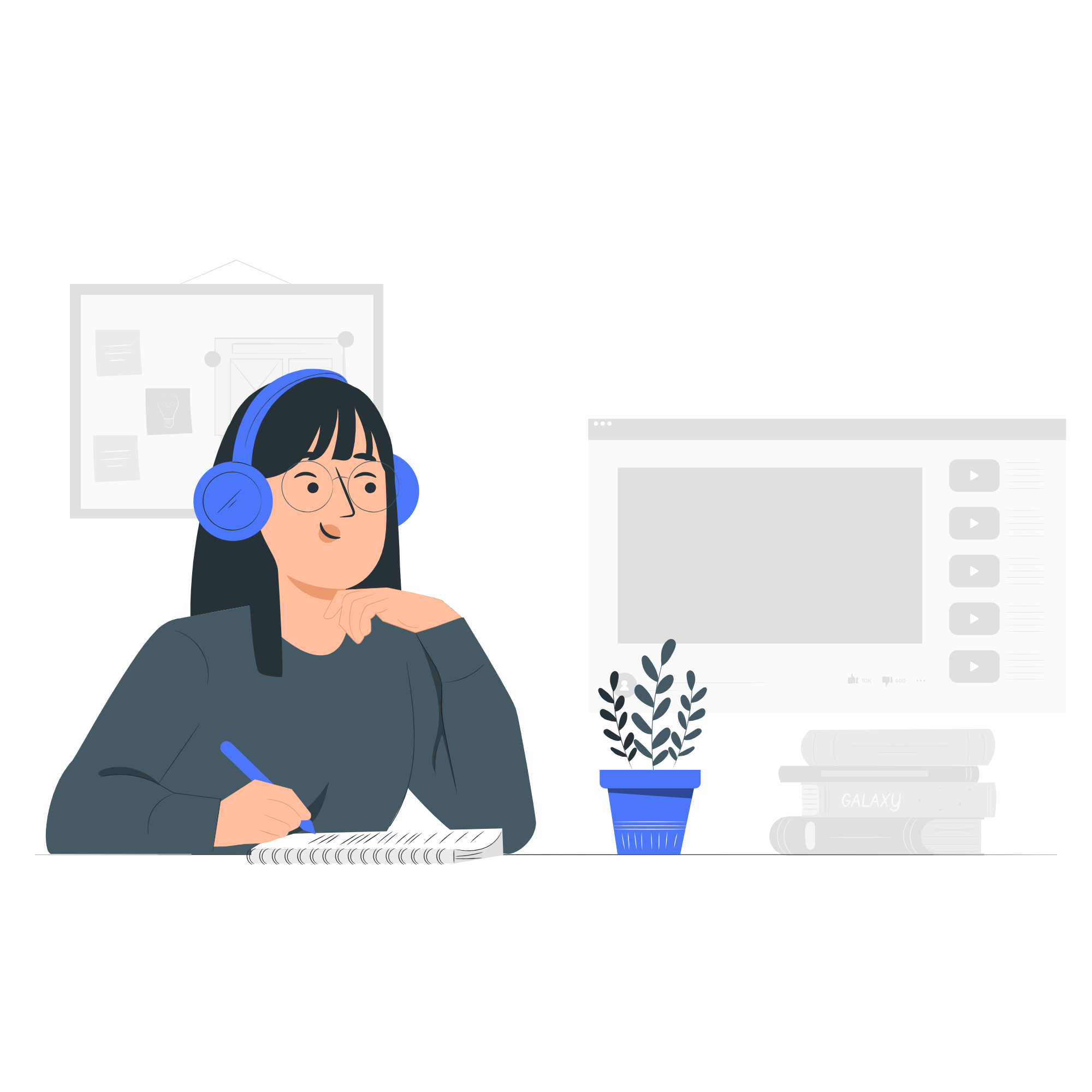
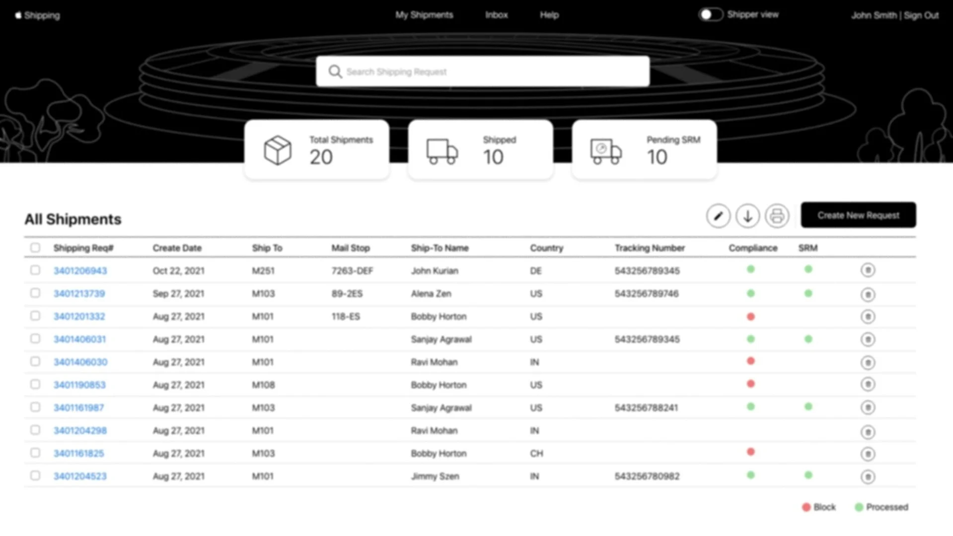
Shipping - Application Website
Apple's internal Shipping Application is the approved platform for handling end-to-end shipping requests for internal materials. Employees use the service to send shipment requests for admin purposes.

Problem
The existing application had several pain points that prevented users from completing key shipping workflows efficiently.
Solution
Identify current gaps through usability evaluation, then redesign a simplified and improved user experience addressing the identified issues
My Role
Lead UX Designer
My Responsibilities
Gathered business requirements from stakeholders and translated them into low and high-fidelity designs. Presented designs to Apple's internal UX team for usability evaluation. Participated in the evaluation session — observing user interactions and documenting findings. Collaborated with the team to prioritize issues and independently redesigned screens based on evaluation insights.
Duration
Sep 2021 – Jan 2022
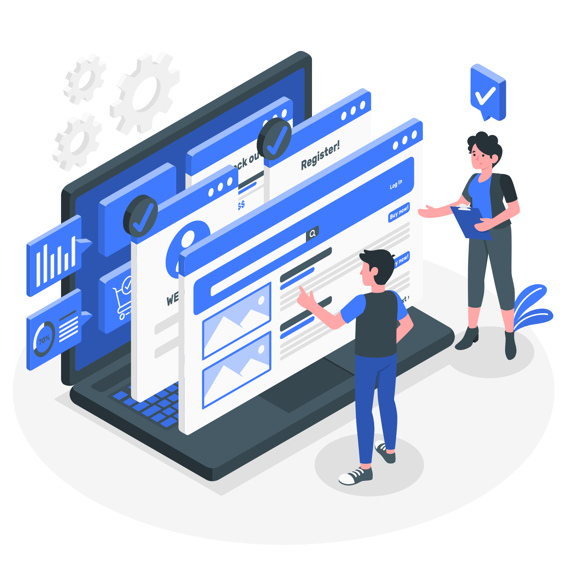
Design Process
I gathered business requirements through multiple discussions with the team. Our goal was to understand the major pain points and usability issues within the current application. We planned a usability evaluation to assess the current state of the user experience - providing a baseline to compare against after prioritization and implementation of design recommendations.

Discovery
Usability Evaluation
To provide context for the usability evaluation, a realistic user scenario was created:
Alena is an Apple engineering manager who wants to send company branded T-Shirts to her team for achieving their goals. She relies on the Apple Shipping platform to make the transition.
This scenario guided the evaluation sessions — helping users understand the task context and giving evaluators a consistent frame of reference for observing interactions.
Scenario
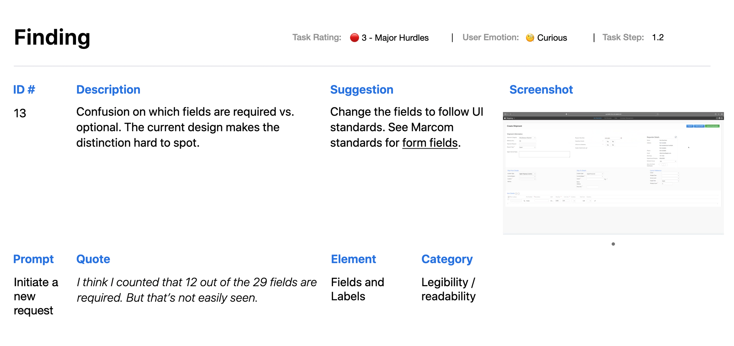
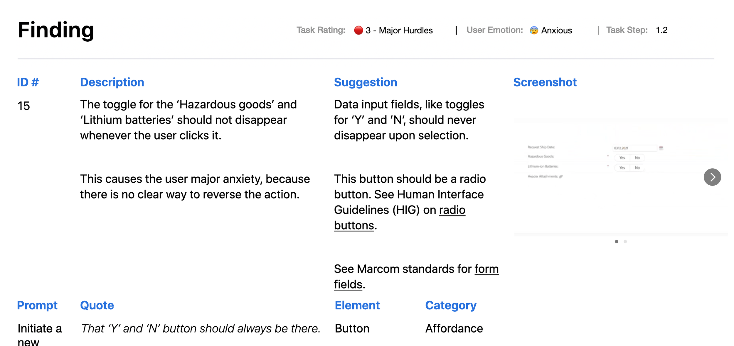
60 issues identified — 45 classified as major, 15 as minor
No tasks completed in the green zone
26 issues caused user anxiety, 12 caused confusion, 22 caused curiosity
Many issues identified as quick fixes for the development team
Evaluation Highlights
Presentation — the app made labels and instructions look different from options
Affordance — needed to provide clearer cues about what things are interactive
Consistency — the app should do the same things in the same way, as the OS does
Top usability areas to focus on
Sample Findings
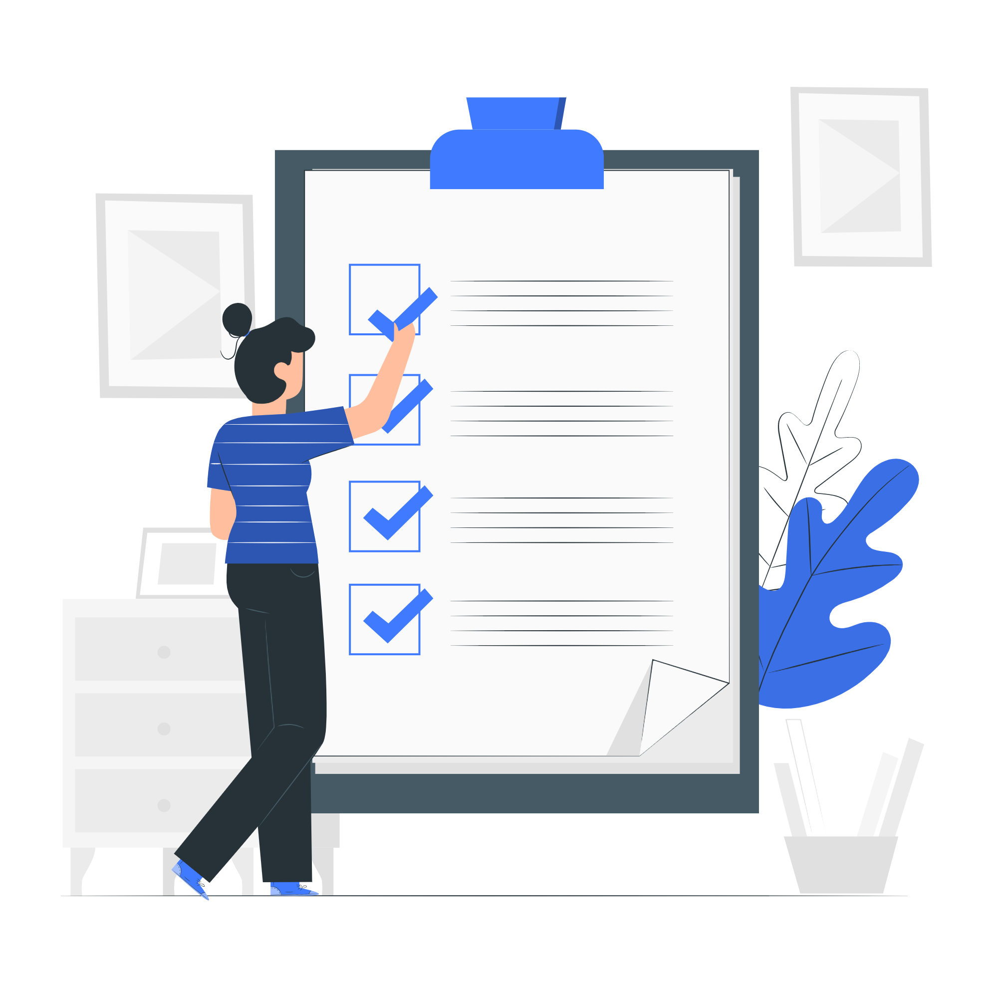
Based on the feedback received during the evaluation, I collaborated with the team to create a prioritization matrix — reaching agreement on which issues to address during the first sprint, balancing user impact against implementation complexity. Following this, I worked on redesigning the screens to address the prioritized issues. Below are a few samples.
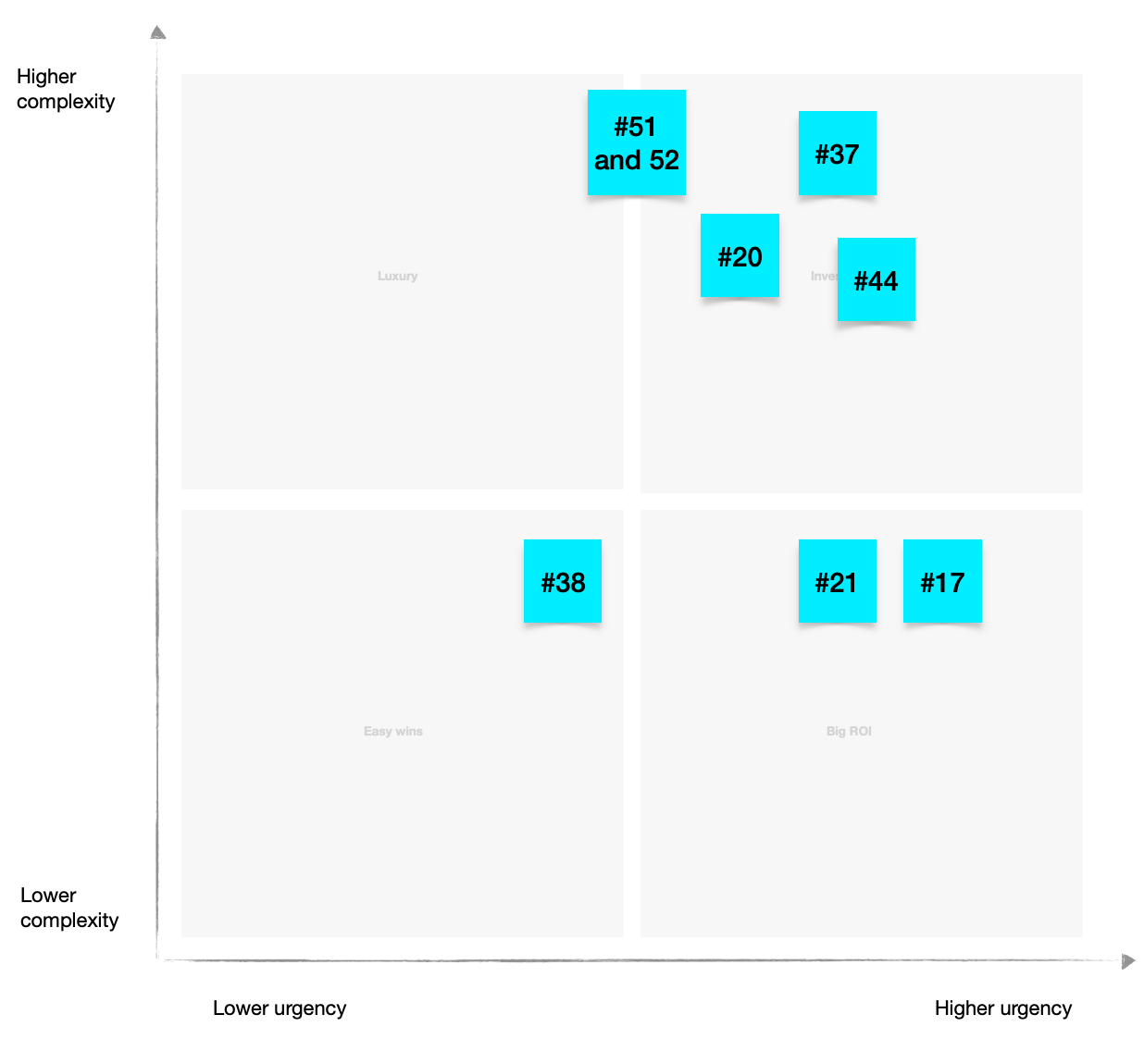
Prioritization Matrix
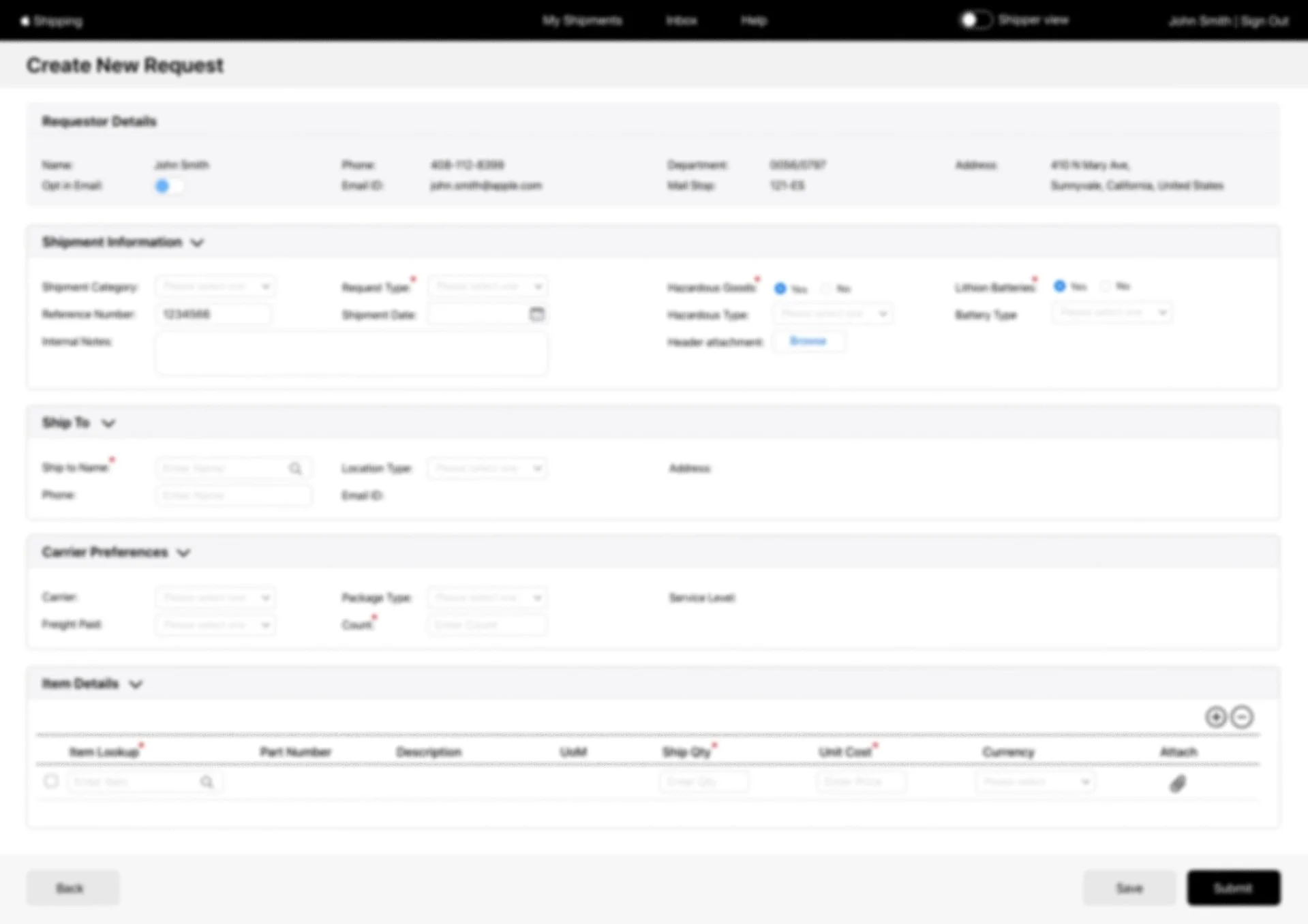
Preview Redesigned Screens
Based on the prioritization matrix I redesigned the screens — addressing the highest priority issues identified during the evaluation. Key improvements focused on presentation clarity, interactive affordances, and consistency across the application.
Once the screens were redesigned, the team conducted further usability testing and addressed the remaining issues before handing the designs over to the engineering team for development. Based on the prioritization matrix, the development team accepted the technical fixes achievable in the first phase.
Seeing real users interact with a product changes how you design. Observing the frustration and confusion firsthand during the usability evaluation made the design problems impossible to ignore - and made the redesign decisions much clearer. Design improvements are most effective when grounded in real user behavior, not assumptions.