FortiData- Discovery Policy Wizard
FortiData is an AI-powered data discovery and classification platform that leverages machine learning to discover, classify, and label sensitive data across on-premise file systems, SharePoint, and cloud environments like AWS. It gives security teams a centralized view of their organization's data security posture.

Challenge
Designing the Discovery Policy flow was complex as requirements evolved throughout the process:
Users needed to select data classifiers, build context conditions, and configure automatic labeling — all within a single guided flow
Classifier selection changed mid-design from single to multiple
The labeling step changed from manual to automatic with three options
The Actions step was removed as the product evolved
Each step had dependencies on previous selections - making clear contextual messaging throughout the flow essential
Solution
A clean guided wizard that walks security administrators through policy creation step by step - from data classification and context conditions to automatic labeling - with clear contextual messaging at every stage to guide users through complex decisions.
My Role
Staff UX Designer
My Responsibilities
Collaborated with the UX Manager on the initial wizard design. When new requirements came in, independently drove all design decisions and Figma execution — going through multiple review iterations with the UX Manager before reaching final agreement and developer handoff.
Duration
July 2025 – Sep 2025
Design Process

Discovery
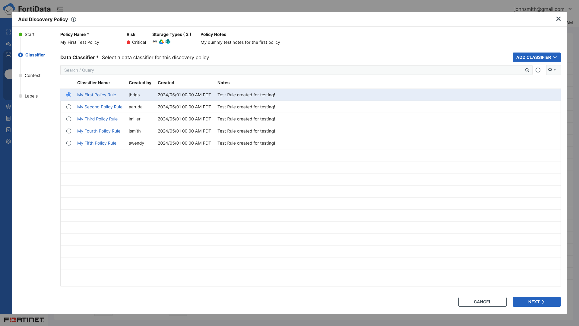
The wizard model was already an established pattern in FortiData — used across other flows including Add Scan and Add Classifier. The Discovery Policy flow initially followed the same pattern with multiple rules, each requiring conditions, labels, and actions.
As the product evolved, discussions with key stakeholders led to significant changes in the policy creation approach — moving away from rule-based configuration toward a simpler guided flow focused on data classifiers, context conditions, and automatic labeling. These discussions shaped the new wizard structure and set the direction for the redesign.

Ideation
The initial wizard structure was designed collaboratively. As requirements evolved I independently drove the following design changes:
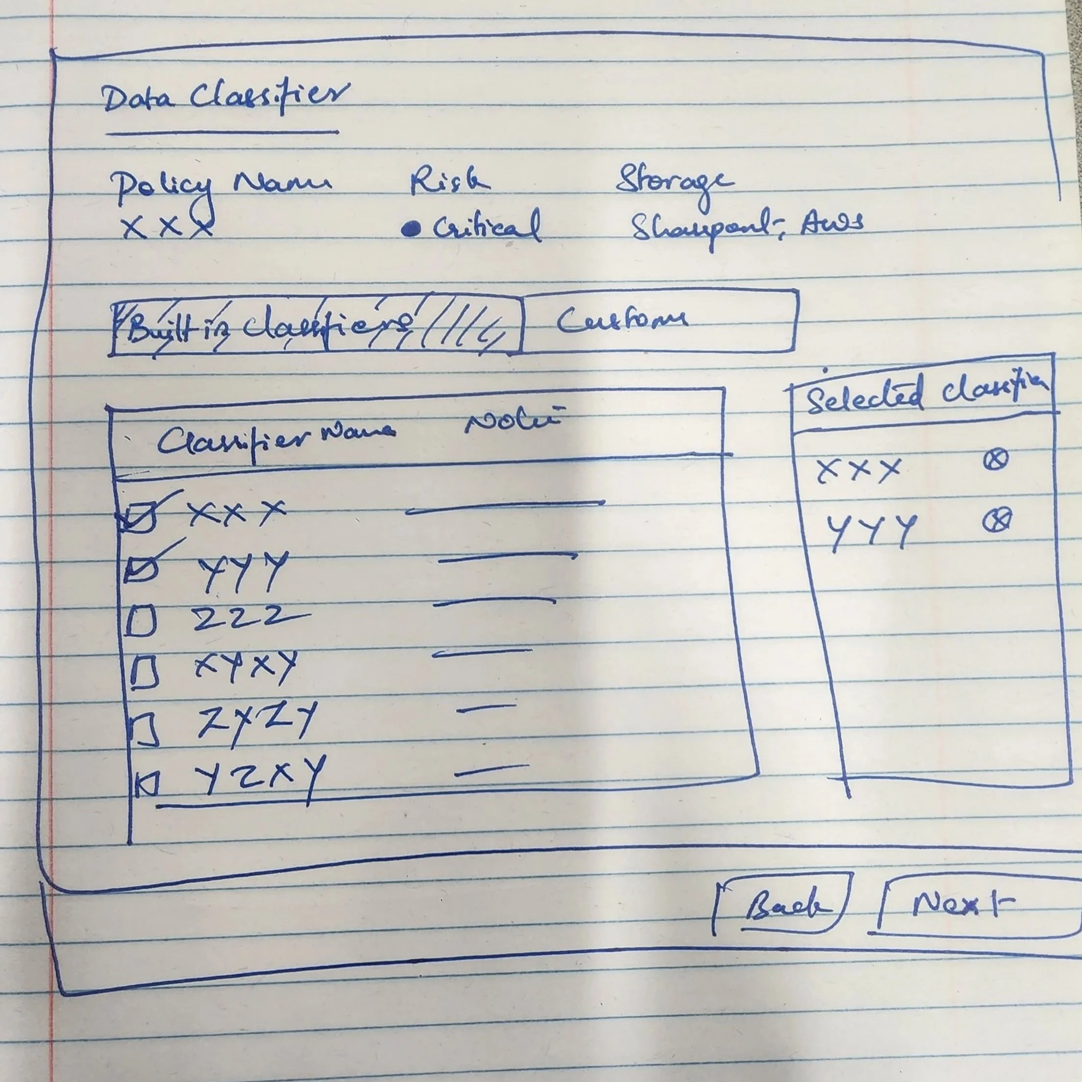
Replaced radio buttons with checkboxes when classifier selection changed from single to multiple
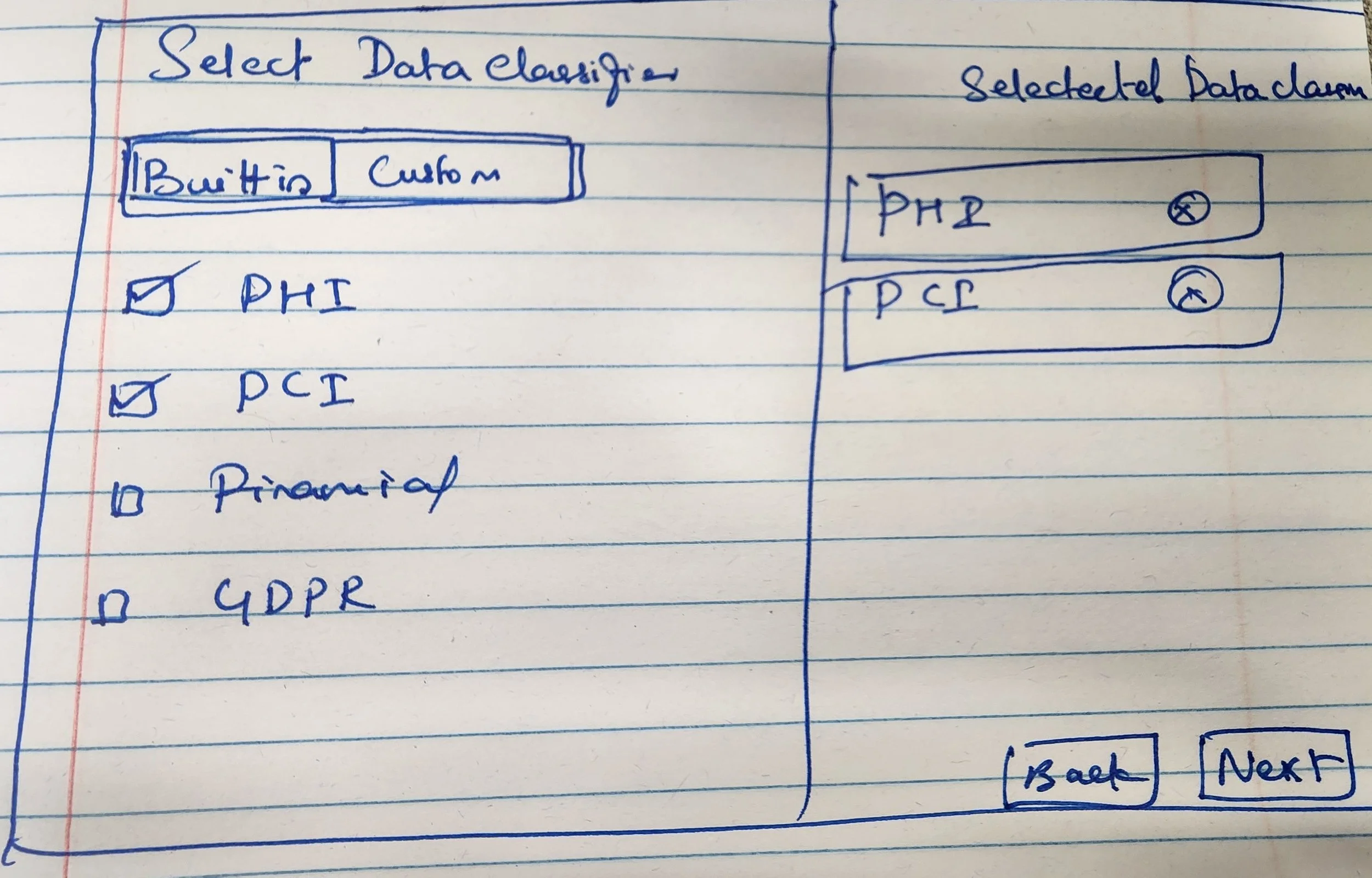
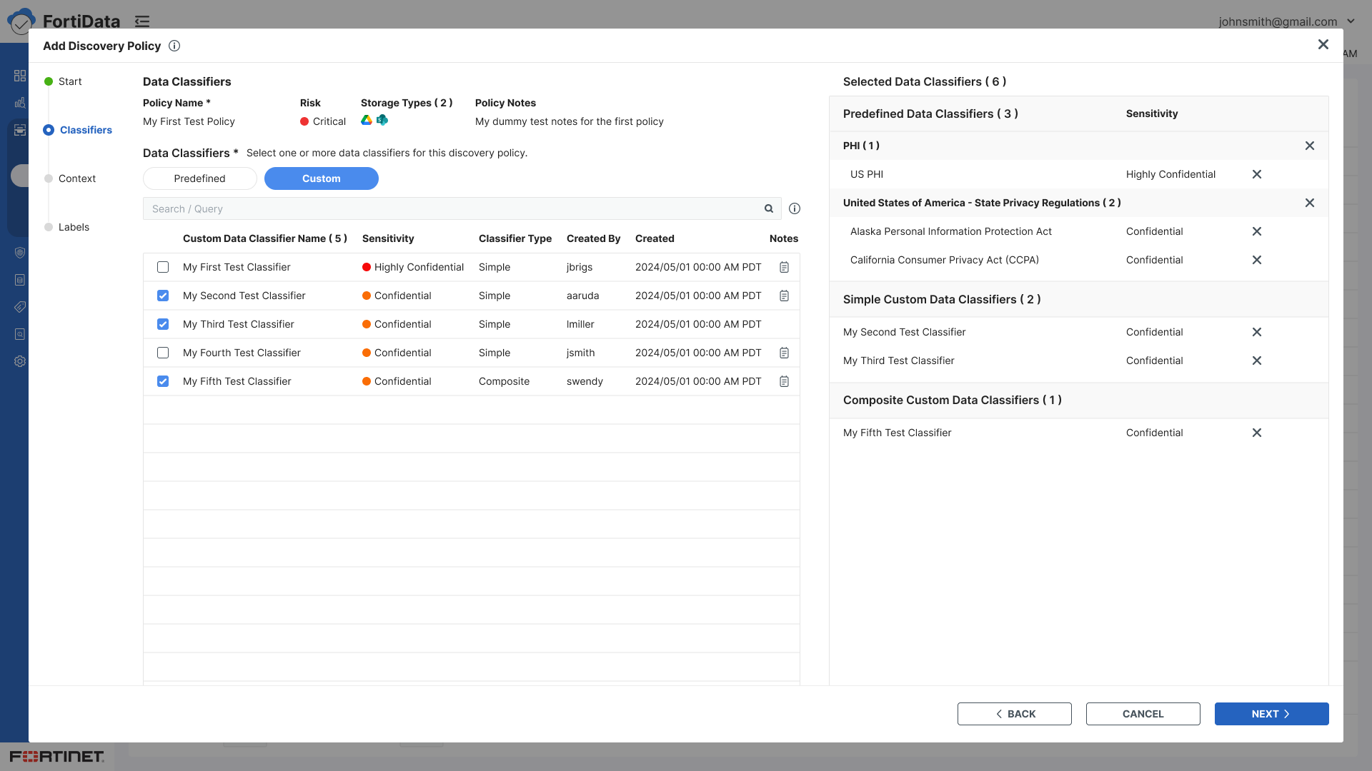
Designed a split panel layout for the Classifiers step — full list on the left for browsing, selected classifiers on the right for easy reference
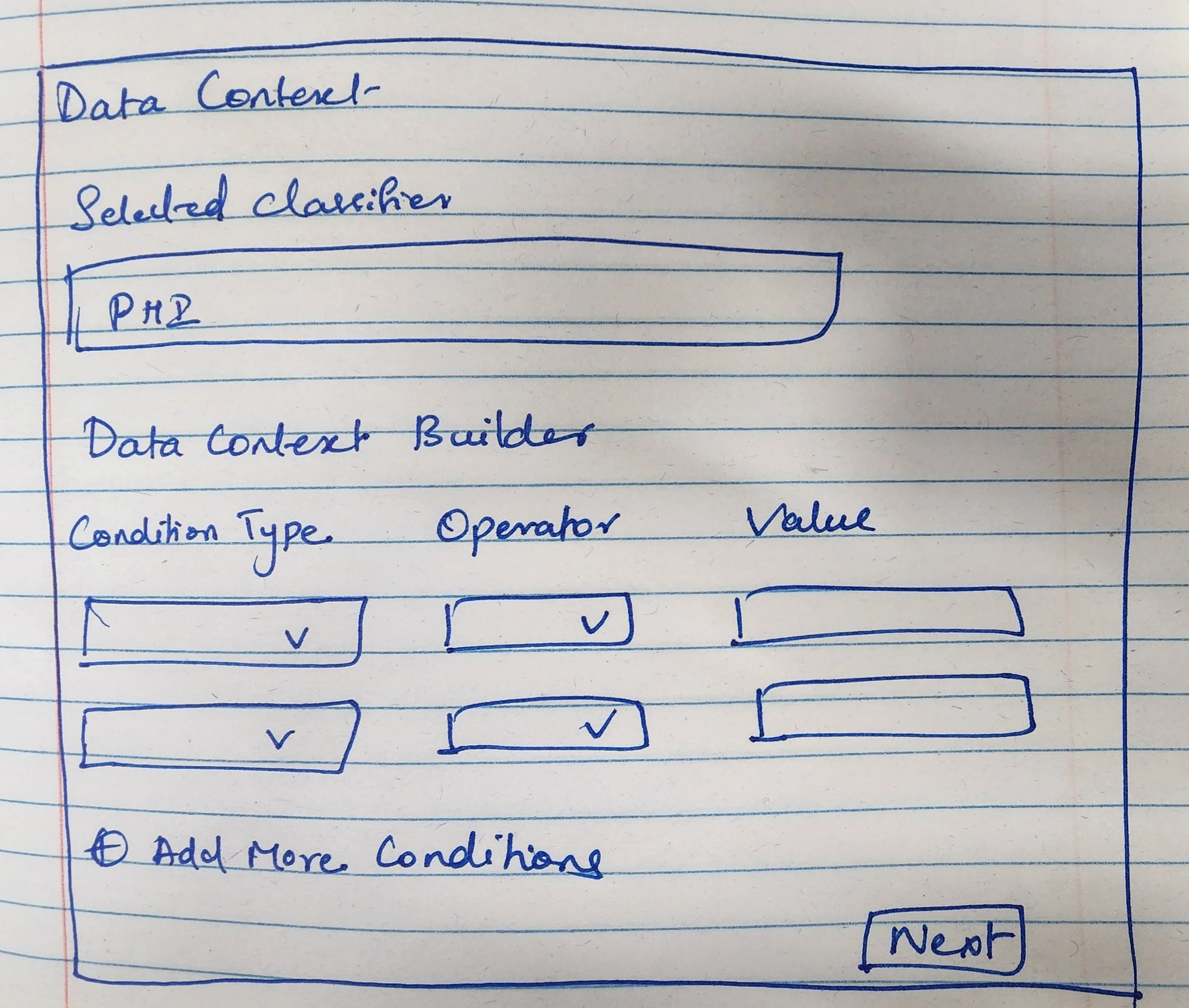
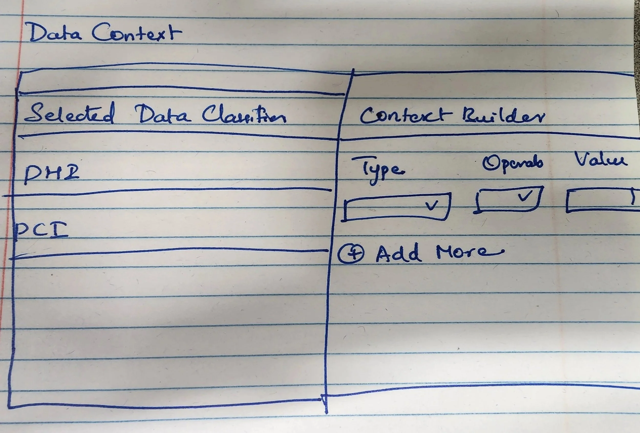
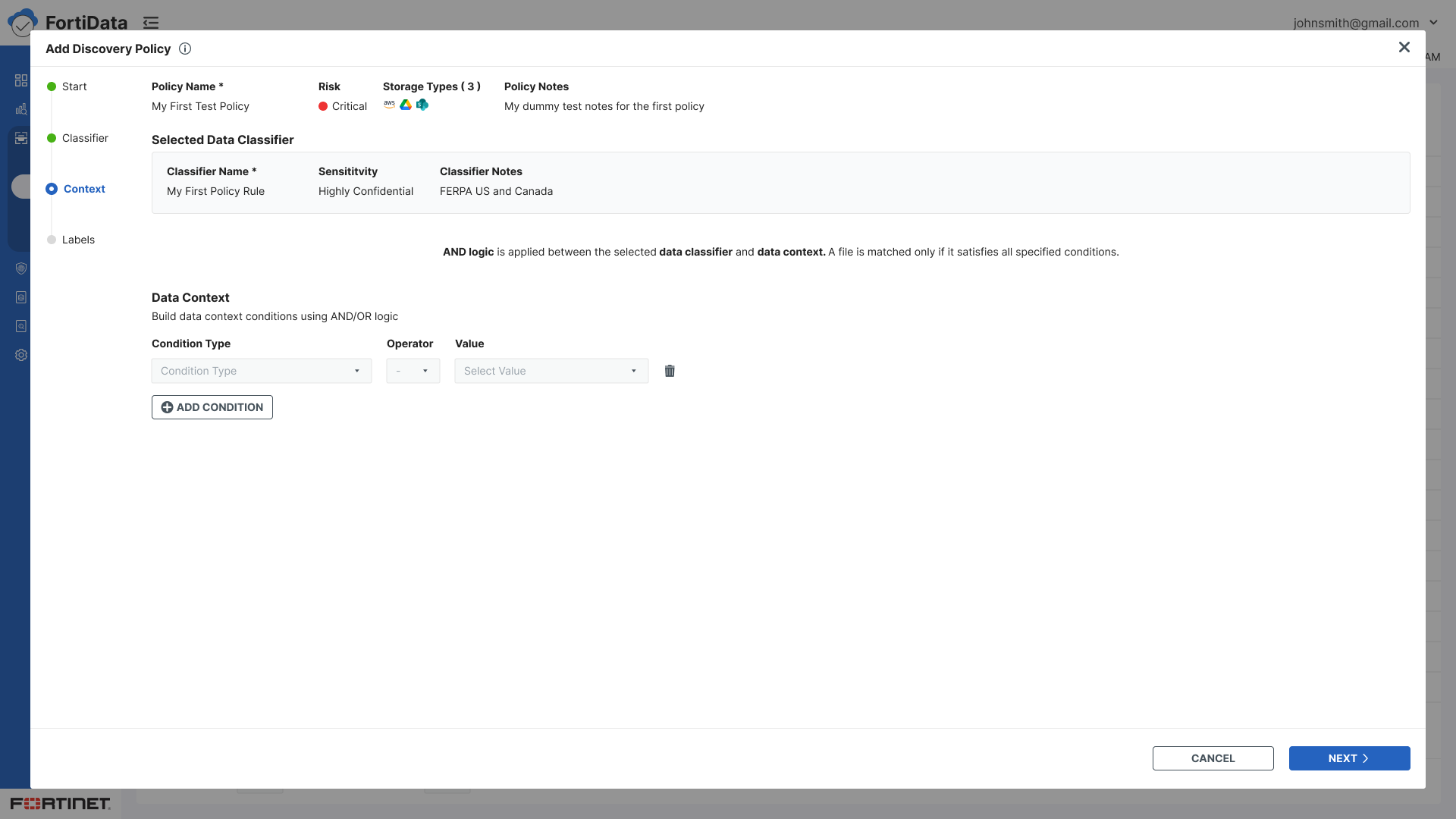
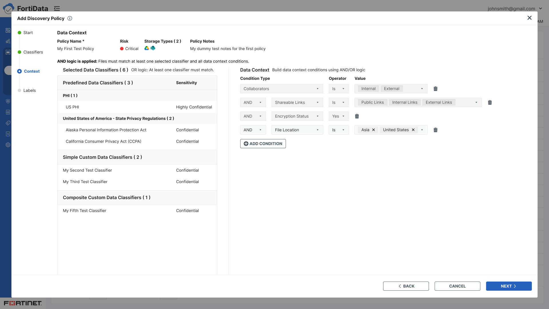
Extended the split panel to the Context step - classifiers on the left, condition builder on the right - maintaining context across both steps
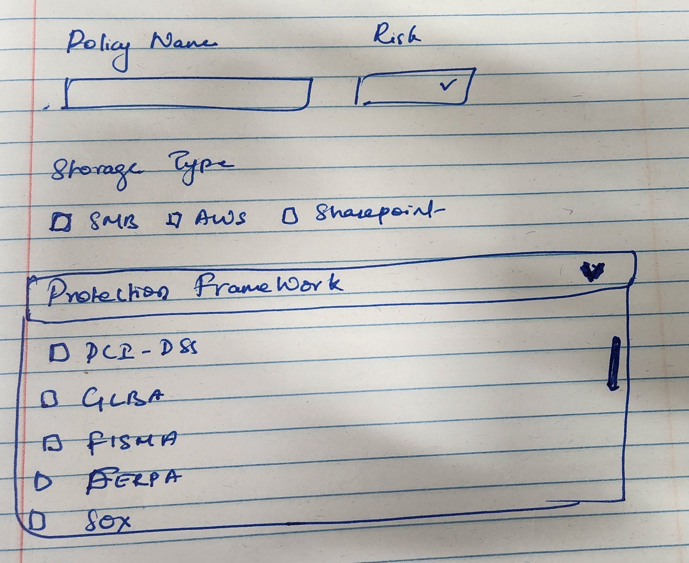
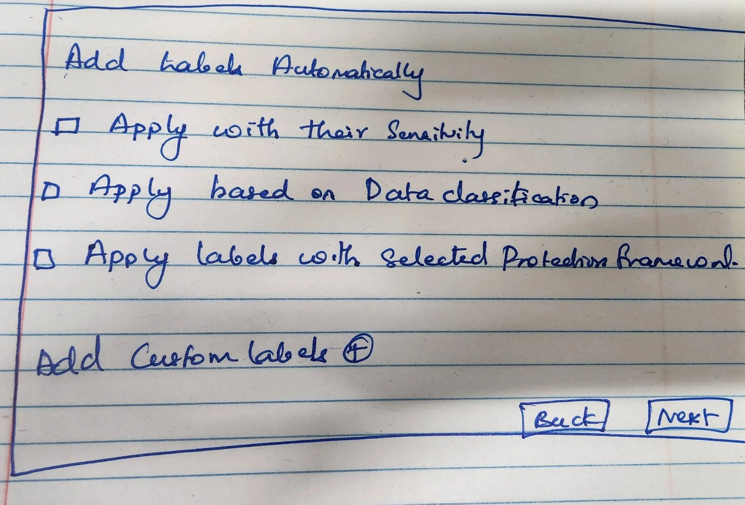
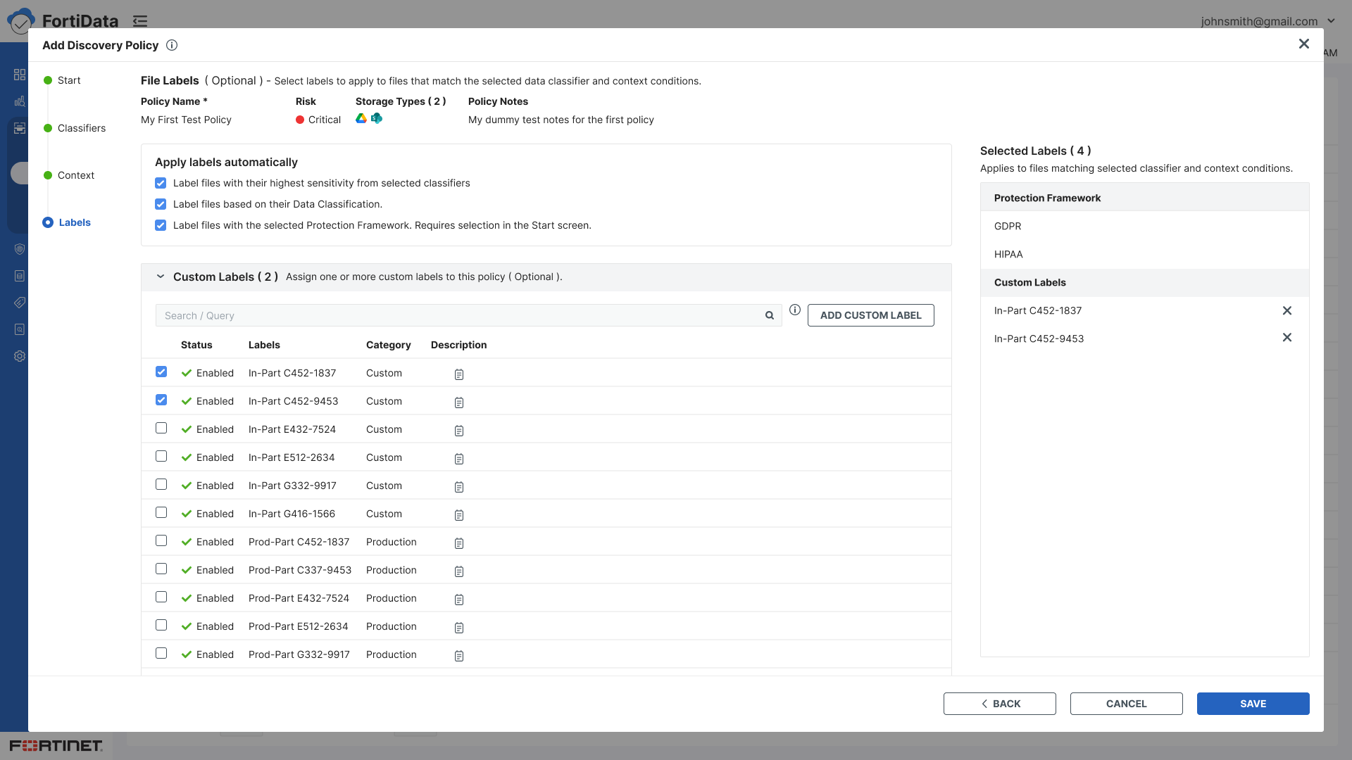
When the labeling step changed to automatic, a key stakeholder wanted the protection framework option de-emphasized and initially did not want any messaging about it on the Labels screen. I explained that if we are showing the option, we have a responsibility to give users clear instructions on how to use it. After discussion they understood and agreed — the framework option was collapsed by default on the Start step, and a clear message was added on the Labels screen: "Requires selection in the start screen."
Added clear contextual guidance text throughout every step

Prototype
The final wizard flow:
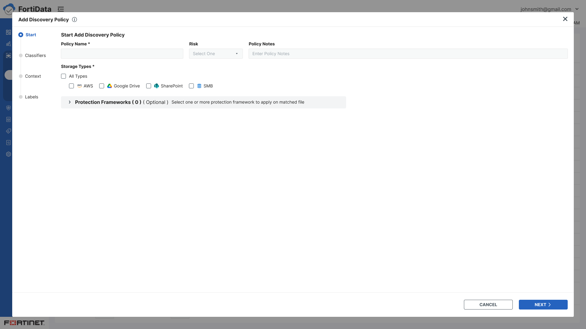
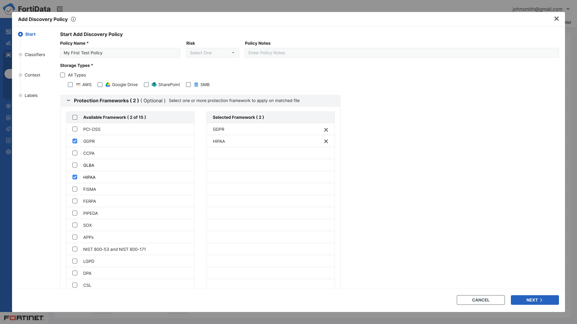
Start - Policy name, risk level, storage types, notes
Classifiers - Select predefined or custom data classifiers using checkboxes
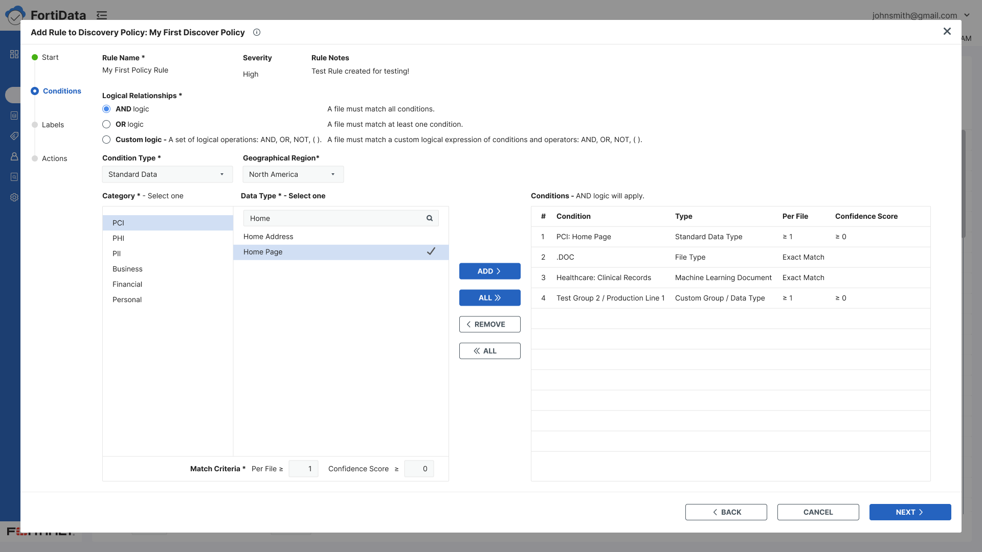
Context - Build data context conditions using condition type, operator, and value with AND/OR logic
Labels - Automatic labeling with three options — highest sensitivity, data classification, or protection framework (collapsed by default)
Review - Final review and save
Key design decisions:
Split panel layout for classifiers and condition builder - visibility of both simultaneously
Selected classifiers displayed on the right panel for easy reference while browsing a large list
Checkbox selection replacing radio buttons for multiple classifier support
Protection framework collapsed by default - present but unobtrusive
Contextual guidance text added throughout every step
Policy context - name, storage type, risk, and notes - visible throughout all steps so users always knew which policy they were configuring


Test
The designs went through multiple internal review cycles with the UX Manager and product lead before development handoff. These reviews were thorough - it was during this phase that the requirement to support multiple data classifiers was identified, leading to the shift from radio buttons to checkboxes.
Inconsistencies were resolved iteratively until the design was agreed upon and handed off to the development team for implementation. QA testing was then conducted post-implementation to validate the final product.
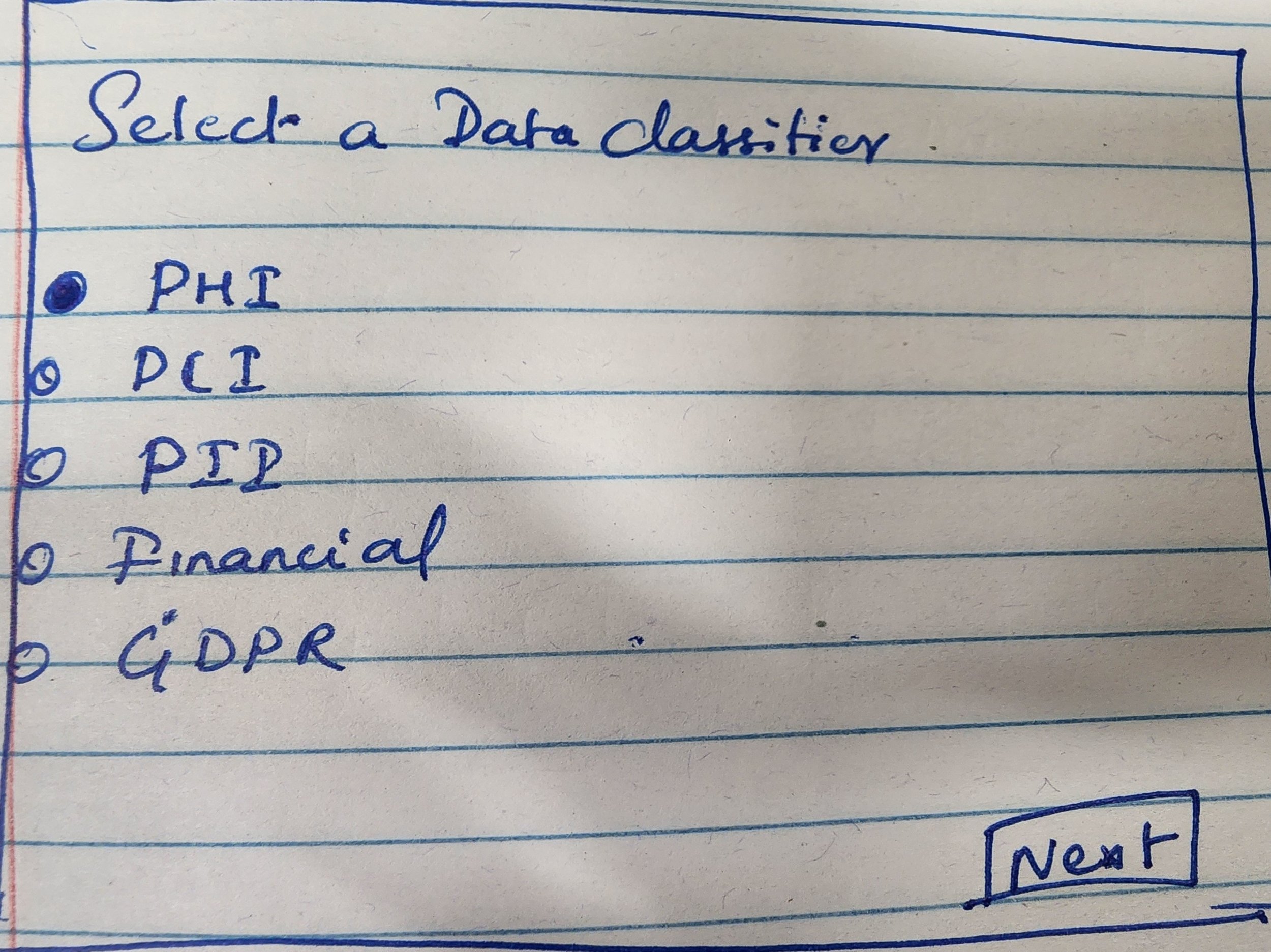
Initial Wireframes
High Fidelity

Key Takeaways
Designing for clarity sometimes means pushing back. And clarity isn't just about what you show — it's about when you show it, how you connect steps, and making sure users always know where they are and what comes next. That was the principle behind every decision in this flow.